Next case study
Flexmail
After 12 years of development-driven design, Flexmail’s product needed a fresh start. It was not only hard to use but also hard to cut in legacy features and the linked client expectations. How we managed to help them?
Conversation Starter is an online networking tool that allows people to plan short meetings with each other, online or in person. Successful meetings are at the core of Conversation Starter’s product. We helped to improve their user experience, making it easier for users to host networking events and planning meetings. Having people plan more meetings, that was the goal.

When planning meetings, scheduling the most fitting spot in two people’s agendas can be tedious. That was also the case for the users of ConversationStarter, an online networking tool. Painful because successful meetings are at the core of this product. Enter Smooth Sailing!
Connecting people and organising meetings is at the heart of Conversation Starter. However, while talking to users and observing how they use the product, we found some shared problems.

01 / Issue
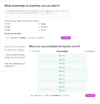
It was unclear how they could set their meeting availability.
02 / Issue
If they did find the settings, they were unsure whether or not their availabilities had been saved after changing it.
03 / Issue
They experienced the interface as text-heavy and expected the interface to guide them.

To understand the roots of the problem, we dove into the data that Conversation Starter has - how many meetings people have, how many open slots there are, and how many opportunities there are to grow. We also talked to several users and learned how, when and where they plan their attendance at online events. This made us realise that instead of focussing on the meetings people already booked, we should focus on the ones they didn't book.

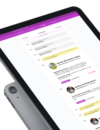
So we started puzzling components and trying different interfaces that would lead to a great user experience for those attending the conferences. By giving a chronological overview of what meetings were planned, what talks are given and when you are available, we could provide insights into what meeting opportunities are still there. We prototyped and tested this interface and fixed every last usability issue before briefing the engineers on how this could be implemented.

Next case study
After 12 years of development-driven design, Flexmail’s product needed a fresh start. It was not only hard to use but also hard to cut in legacy features and the linked client expectations. How we managed to help them?