 Payflip
Faster client onboarding through self-service software
Payflip helps employers boost net pay through smart compensation tools. Their product was strong, but their onboarding was holding things back.
Clients were sent a Google Form, then the customer success team would step in to follow up, explain things, check what was missing, and do a lot of manual chasing. It got the job done, but it took up hours.
Payflip knew they could do better. They just needed a way to make onboarding part of the product, without losing the personal touch. That’s where we came in.
How we helped
-
Mapped the manual process from start to finish
We sat down with the Payflip team and walked through the full onboarding flow as it was happening today. Not just what was supposed to happen, but what actually did. This helped us understand which steps were essential, which ones could be automated, and what a better flow might look like. -
Identified the high-impact areas to digitise first Rather than trying to digitise everything in one go, we focused on the steps that were causing the most friction, both for clients and internally. We translated these into a first version of the in-app onboarding experience. The goal wasn’t just to move it into the product, but to make it genuinely easier for clients to get through.
-
Tested with real clients and improved based on feedback Once we had the first version ready, we tested it with clients who were actively onboarding. We observed where they hesitated, what questions they had, and how well the flow supported them. Then we refined the flow, and made sure the team could keep adjusting it as the product evolved.


What changed (and why it matters)
-
Clients can now onboard themselves, in about 2 hours
What used to take 12–15 hours with manual support now takes just 2 hours, fully self-serve inside the platform.
That’s time saved for both users and the Payflip team, without sacrificing clarity or control. -
The process is clearer and more transparent
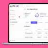
The guided interface shows what’s already done and what’s left to complete, making things easier for both clients and internal teams. -
It scales without extra headcount
With a structured onboarding flow in place, Payflip can support more clients without increasing overhead.