What happens when two legacy tools need to become one?
Managing property comes with its fair share of complexity — from urgent repairs to long-term budgeting. That’s where Dobby steps in: a platform that brings clarity to communication between property managers and homeowners. They had just rebranded and needed to merge two outdated systems into one cohesive product. The problem? No clear roadmap to get there, and a lot of scattered user feedback to make sense of.
How we helped
- Digging into the details
The Dobby team already had lots of customer feedback. But they lacked clarity on how syndics actually work day-to-day. We ran interviews, shadowed users, and identified key workflows that needed more structure, especially around navigation and permissions. - Designing together, in short sprints
We focused on collaboration: one sprint, one problem, one solution at a time. Instead of long documents or endless meetings, we worked in focused design sessions, with the Dobby team right there with us, to speed up alignment and keep everyone close to the decisions. - Testing and refining with users
For every challenge, we started with user input and internal insights. Then we built wireframes, mapped flows, and prototyped ideas. Everything was validated, with real users where possible, to make sure we were moving in the right direction. - Balancing flexibility with structure
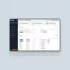
Syndic offices vary a lot. Smaller teams need access to everything. Bigger ones need clear roles and boundaries. We built a navigation and permission system that adapts, so everyone gets what they need. - Making the complex feel simple
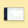
Old tools were messy and overwhelming. Dobby needed to surface what really mattered, especially in high-stress moments (like when the garage gate is stuck open at 3 a.m.). We designed a modern, intuitive interface that puts urgent tasks front and centre, so users can act fast and with confidence.
What changed (and why it matters)
-
Refined UI patterns built to scale
We designed reusable patterns for navigation, task management, and communication. All tailored to fit Dobby’s new branding and real user needs. -
Clear and intuitive in high-stress situations
The new design supports syndic teams when it matters most, especially in urgent moments like dealing with technical breakdowns or tenant issues. -
Seamless collaboration with the Dobby team
We worked closely with both the front-end and back-end developers to plug in the skills needed to bring this next-generation platform to life.